Sunshine. Daisies. Sweet lemony pie. All cheerful images we usually associate with the warmth of yellow. And yet, studies show that babies cry more often in yellow nurseries and that married couples argue most inside kitchens painted in, you guessed it, the “happiest” color.
As bright and energetic as yellow is, its intensity can also evoke negative emotions that bring out frustration and loss of temper – just ask any parent who’s stepped barefoot on a yellow Lego brick! The truth is, attention-grabbing yellow is not only the most eye catching (that’s why road hazard signs are universally yellow), it’s also most likely to overstimulate short fuses and cause eye fatigue because of the large amount of light it reflects.
That’s no reason to shy away from yellow, which is complex but certainly still has its good traits. After all, yellow is known to be an energy-booster for the five senses, internal organs and blood circulation; stimulates memory, heightens mental sharpness; assists in concentration, memorization, communication; and sparks creativity.
However, the secret to using yellow is knowing how to harness its power. Here are some tips:
Create an illusion of illumination (from sunlight to candlelight) in rooms or hallways without windows. Yellow is often recommended for northern exposures or climates that tend to be overcast and cloudy.
Temper yellow by mixing it with other colors like white and beige. The result will be as buttery and comforting as a smooth French vanilla latte.
Strike a better balance by pairing the surprisingly-versatile yellow with nearly any other color. Some great combos are yellow with grey (sophisticated), lilac (soothing), white (uplifting), rose (chic), green (lively), orange (juicy) or brown (earthy).
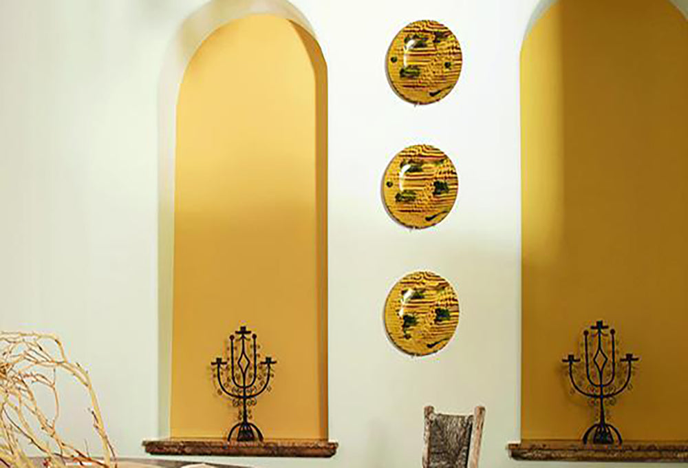
Yellow as a neutral? Yes please! Consider yellow accents or oversized furniture to bring warmth to a cool blue room. As a muted neutral, yellow has the ability to anchor more saturated, bold contrasts like black and navy.
Disclaimer: There are no bad colors, only poor design choices. Many of the moods and reactions associated with certain colors are directly linked to past personal experiences and influences. Side effects may include relying too much on favorite or “safe” shades and the inability to try different hues. We firmly believe that every color has uniquely positive traits and, when used as directed by a professional, the potential to inspire and elevate really great living spaces. Ask our design team for details.
For 50 years, Benjamin Moore's Historical Color Collection has brought the character of 18th- and 19th-century design into modern homes. From the quiet confidence of Stonington Gray to the bold statement of Heritage Red, these are the shades that never go out of style. Take a look back at where the collection began, and discover the ten colors still shaping homes today.
Discover Raindance 1572 from the Benjamin Moore Color Trends 2026 palette. Explore pairing ideas, similar hues, and expert color guidance from Regal Paint Centers, Maryland & the Washington, DC metro area
Explore Southwest Pottery 048 from the Benjamin Moore Color Trends 2026 palette. Discover pairing ideas, similar hues, and expert color guidance from Regal Paint Centers, your local Benjamin Moore dealer in Maryland & the Washington, DC metro area