Which of these past picks stands out as your favorite?
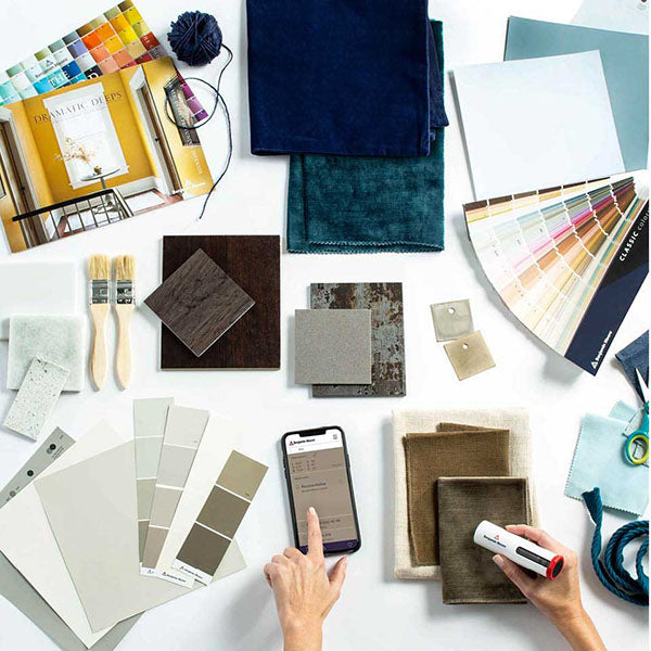
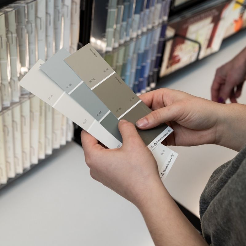
With Benjamin Moore’s 2022 Color of the Year being announced shortly, we’re feeling nostalgic about the choices unveiled over the past decade. Each one perfectly captured the look and feel of that moment in time, reflecting the year’s global trends in art, fashion and interior design.
We’ve put together this fun color yearbook to take a look back at some of the superlative selections of the past. Be sure to come back and join us on October 13th to see this year’s crowning choice for Color of the Year!
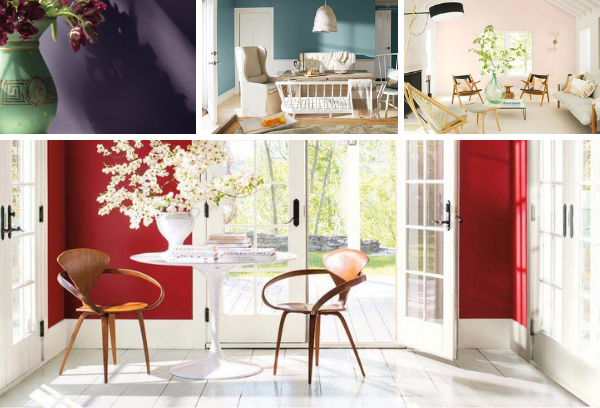
Most Likely To Succeed without Really Trying A classic that never goes out of style, this beautiful hybrid blue is versatile with universal appeal, working well in traditional, modern and even historic homes.
Most Likely To Brighten Your Day This luscious yellow uplifts without being overpowering, complements almost any color palette, and provides a unifying element for diverse spaces.
Most Likely To Find Inner Peace Reflecting the fresh color cues and pastel trends of the year, this gorgeous, ethereal blue serves as a "new neutral" that is both livable and functional.
Most Likely To Win a Nobel Prize The color that ties things together, this silvery green works well with, everything. No worries. No second thoughts. Just a whole lot of harmony and happily ever after.
Most Likely To Become President More than a design trend, white is a design essential, and this color choice demonstrates how the popular neutral can be transcendent, powerful and polarizing at the same time.
Most Likely To Bring the Drama This moody and mysterious master of ambiance is a rich, royal amethyst that can fade into the soft lilac-grey of distant mountains or morph into lustrous coal.
Most Likely To Be a Social Influencer A confident color that is vibrant and full of richness, ravishing Caliente brings the heat while pushing us all to become bolder – in big or small ways.
Most Likely To Marry a Millionaire With its cool blue undertones, this sophisticated gray-blue babe is an understated yet glamorous gray that makes spaces feel serene and ultra-sophisticated.
Most Likely To Lead the Cheer Squad This fresh and luminous blush-pink stunner is soft and airy, bringing a revitalized spirit and rosy outlook that lifts the mood in a flirty, flattering way.
Most Likely To Fill Their Passport An exceptional balance of blue, green and gray as inviting as Greece’s famous bluish-green sea, this soothing mid-tone washes over us with a sense of calm and casual elegance.
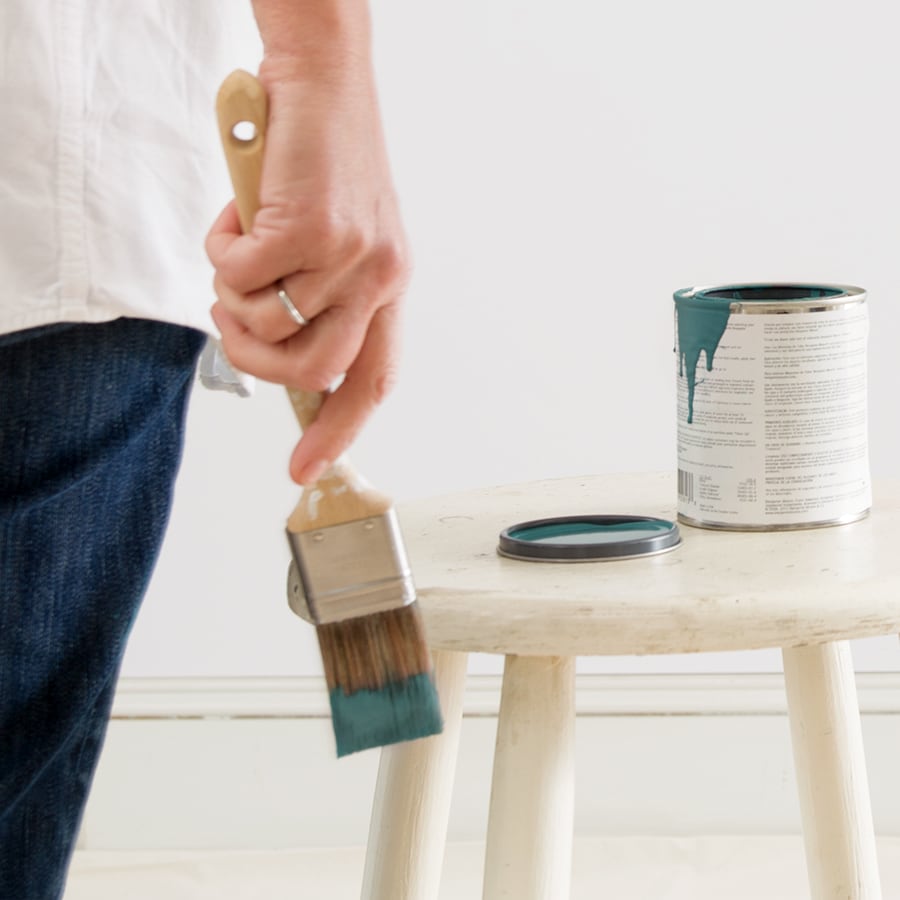
Of all these amazing choices, which one stands out as your favorite? And don’t forget, if you’d like to dip your paint brush into any of these gorgeous colors, visit us in-store or online to order a sample.
Find fresh color inspiration for 2026 with Benjamin Moore’s new Color of the Year and Color Trends Palette. Silhouette is a study in balance — rich yet restrained, moody yet inviting.
Every year, paint enthusiasts and interior designers eagerly await the announcement of Benjamin Moore’s Color of the Year, a paint trend forecast that sparks excitement and debate. Whether people are quick to embrace the color or need time to warm up to it, the influence on paint and design trends is undeniable. For 2025, Benjamin Moore introduces Cinnamon Slate (2113-40), a color that’s set to redefine how we approach interior paint choices.
With the 2025 Color of the Year on the horizon, it's the perfect time to reflect on the stunning hues that have defined previous years. These colors capture the spirit of each era. Stay tuned October 16th for 2025's Color of the Year.